
Personal Project
PixlProgress: A Video Game Tracker
Creating an intuitive way for gamers to find new games, track their games, read reviews, and stay connected with their friends through an easily accessible mobile application.
Method
User Research, Competitive Analysis, Card Sorting, Information Architecture, User Flows, Design System, Lo-Fidelity, Hi-Fidelity, Usability Testing
Role & Duration
UX Researcher, Product Designer
October 2024 - December 2024
Tools
Figma, FigJam, Google Forms, Notion
CONTEXT
Project preview
THE PROBLEM
With so many games available and platforms to play on, many gamers don’t have an organized system to track their games. There’s Goodreads for books and Letterboxd for movies, but no mobile app that does the same for video games.
THE SOLUTION
Users can organize their games into lists, rate and review games, and connect with their friends. The app helps them discover new games and easily track their own gaming journeys.
DISCOVERY
Uncovering user interest
As someone who loves reading and uses GoodReads daily, I began to wonder – how come there isn’t a known app that does the same for video games? Of course my own self-interest is insufficient evidence for the demand of an app, so I began to ask a few of my peers who love playing video games. Upon bringing up the idea, I was met with a lot of enthusiasm, thus sparking my interest even more.
I then did a Google search, to discover if other gamers shared the same sentiment. To my surprise, I found posts as recent as last month and as far back as 9 years – with no universally used solution.
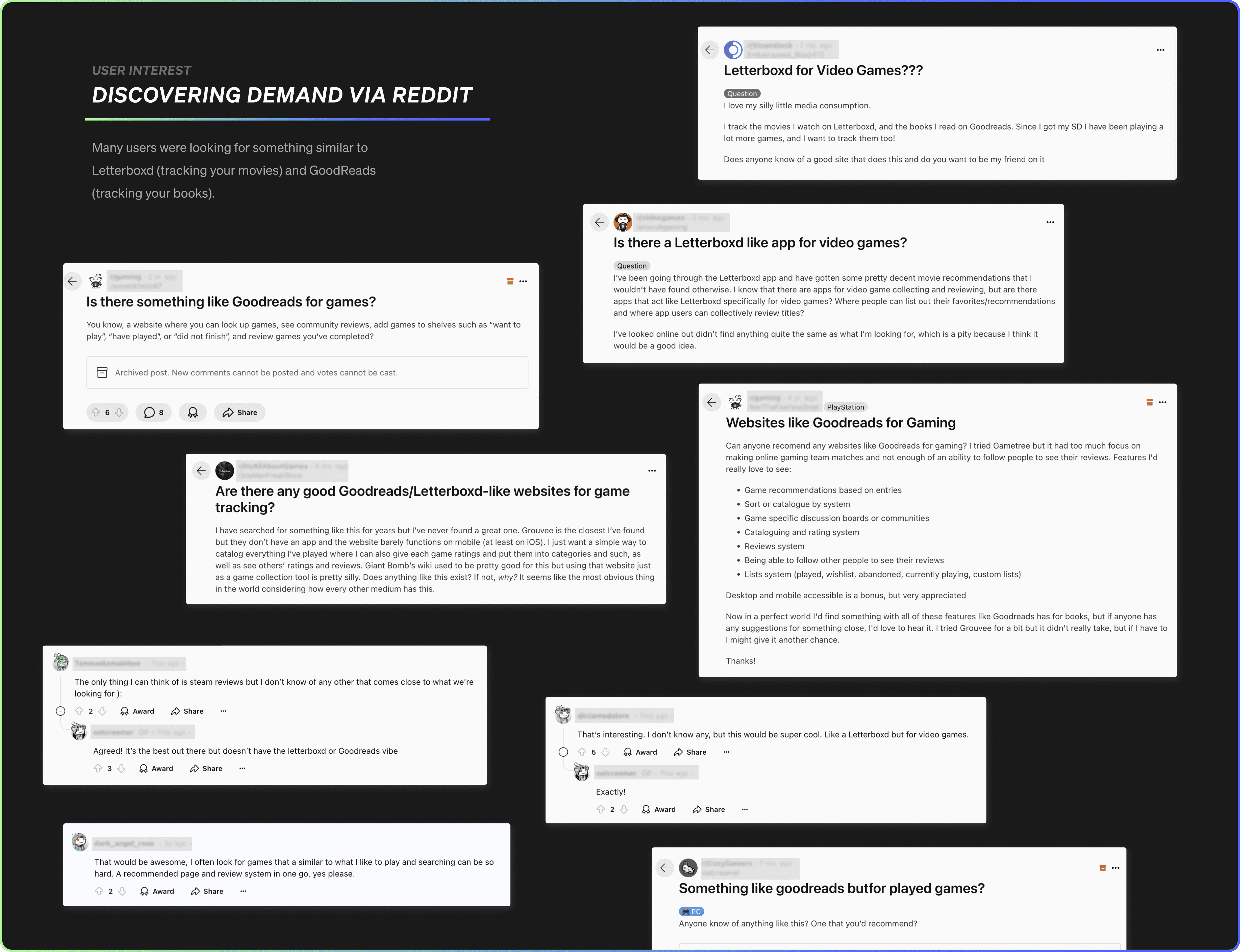
Throughout the Reddit posts I saw some comments mentioned sites like Backloggd, Gameye, and howlongtobeat, but many mentioned that it lacked a lot of must-have features, which we’ll explore in our research.
RESEARCH
Conducting market research and user research to identify user needs and opportunities
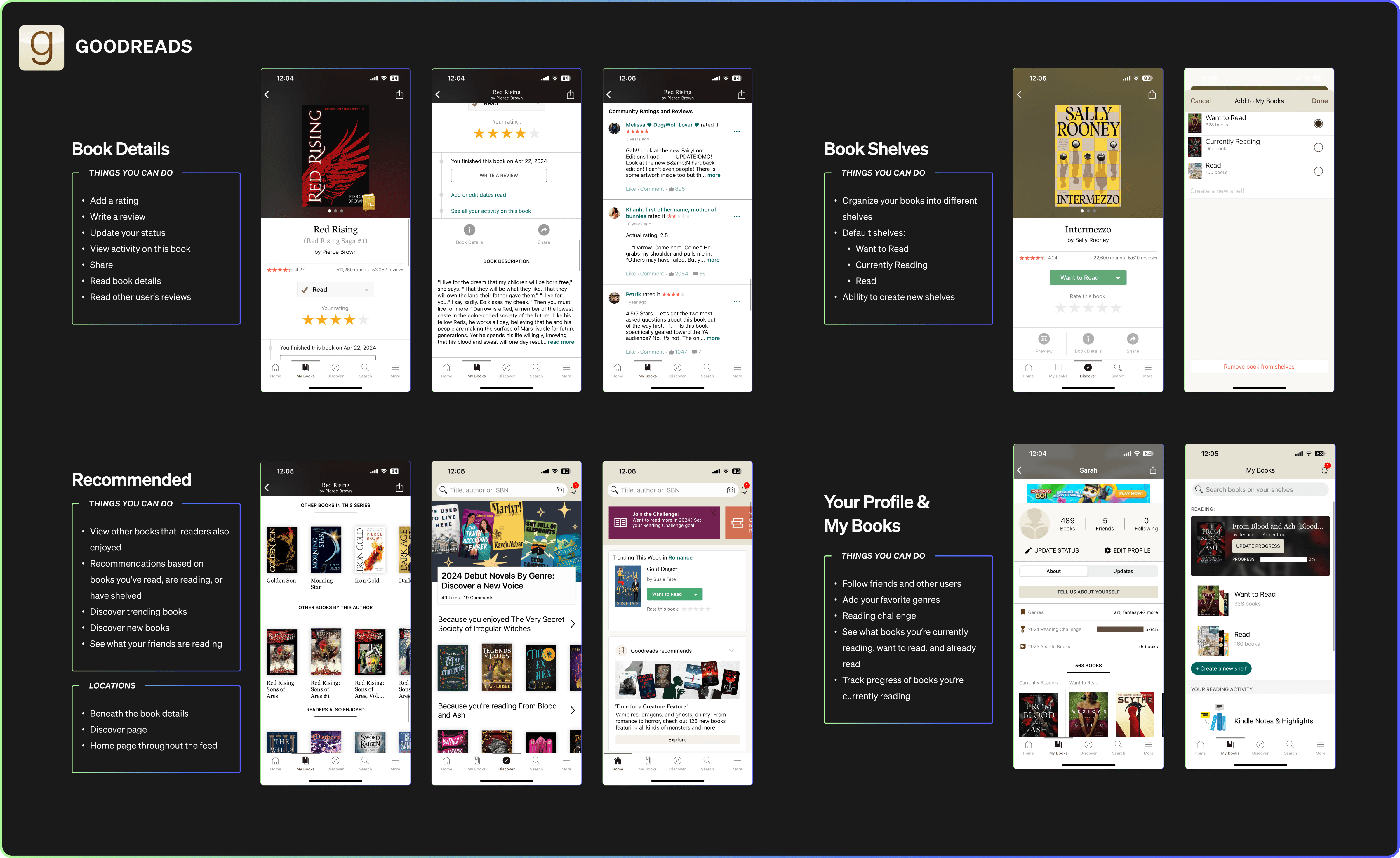
Analyzing GoodReads and Letterboxd – apps with similar feature goals
With GoodReads and Letterboxd having similar goals within their own sectors, I conducted an in-depth analysis of the architecture, user flow, notable features, and drawbacks noticed by users.
GoodReads Analysis

LetterboxdAnalysis
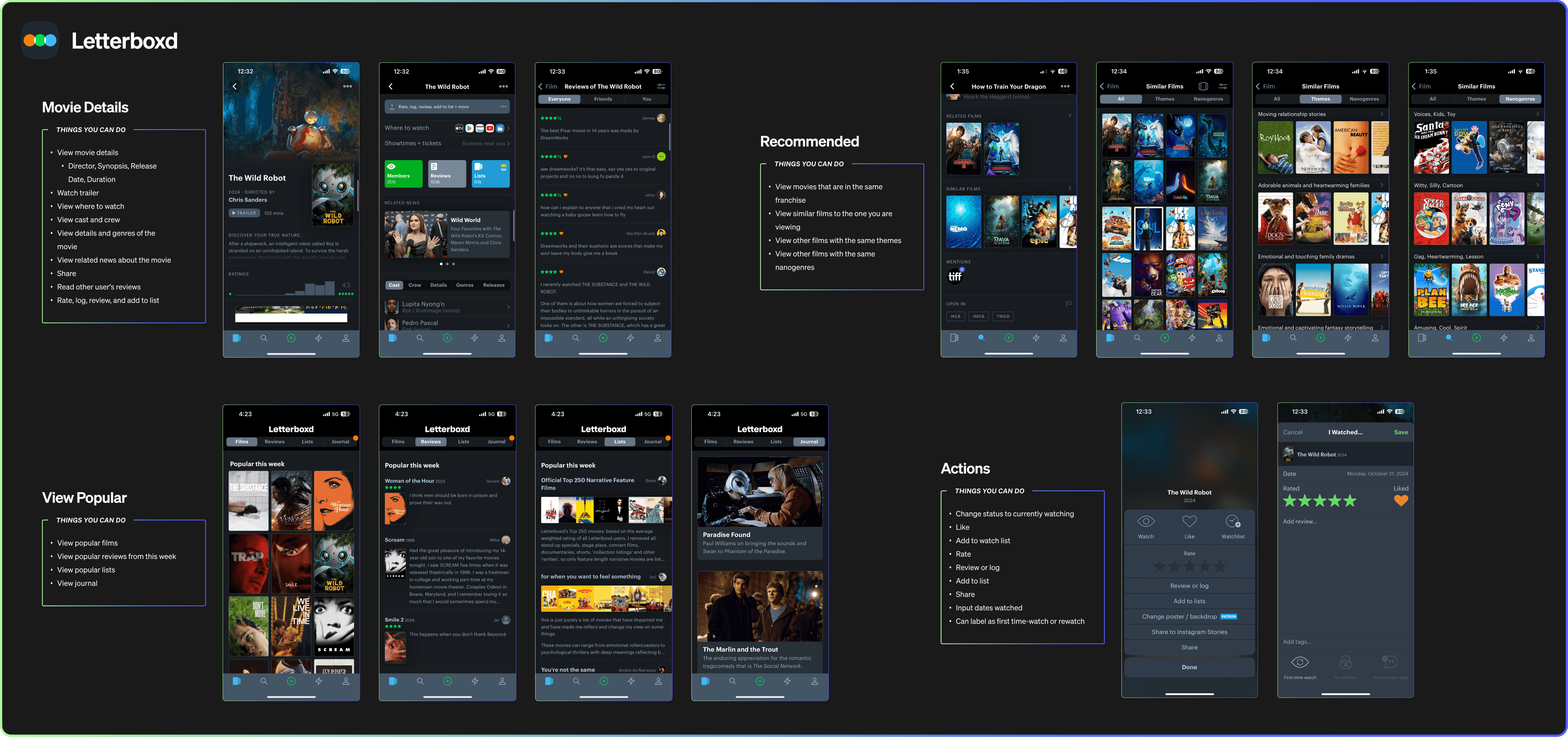

Overall, there were a lot of feature similarities in GoodReads and Letterboxd – primarily the ability to rate, review, track, and obtain details about either books or films. Both apps approached recommendations in similar ways – having recommendations within a given book / film. But Letterboxd prioritized popular recommendations for their discovery. Funnily enough, they had similar drawbacks brought up as well in regards to statuses and searching.
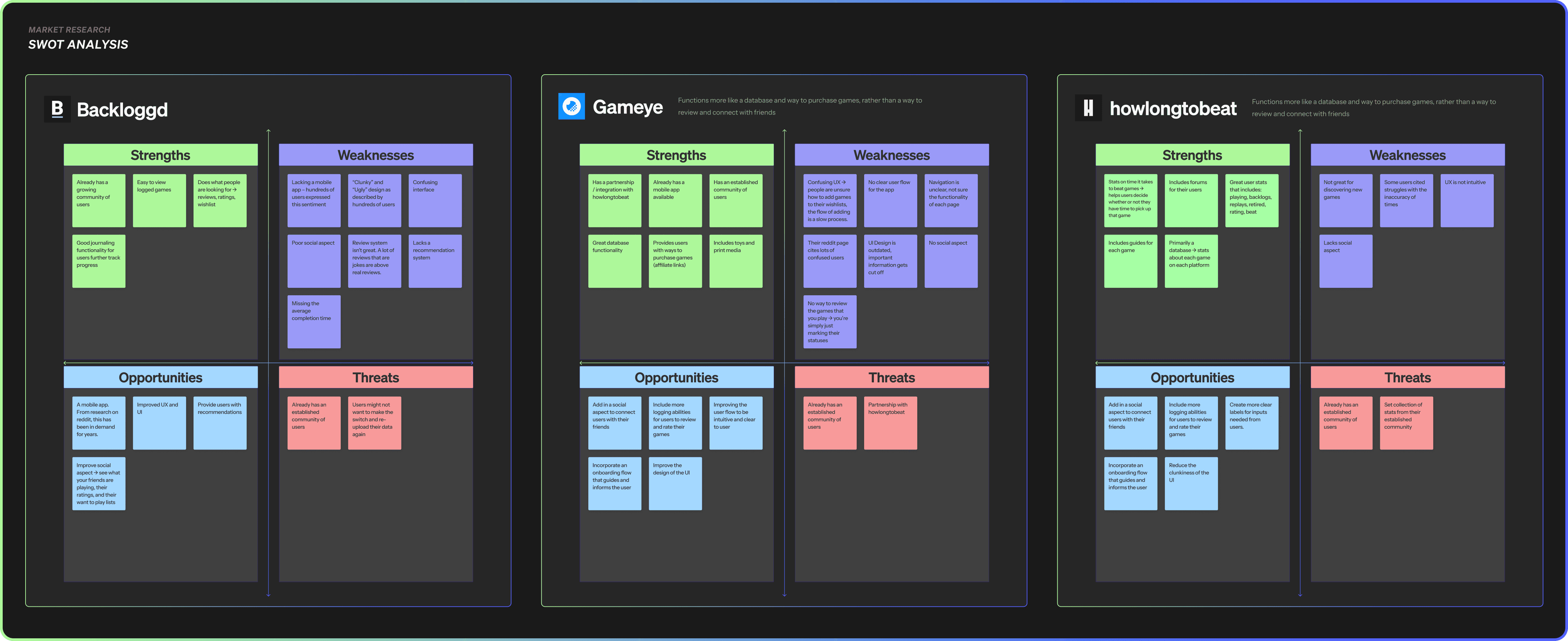
SWOT Analysis on Competitors
After researching possible competitors, I found that Backloggd, Gameye, and howlongtobeat were primarily brought up by Reddit gamers.
Backloggd was the closest competitor to what I am trying to solve with this project, but it lacked some key features and functionality that is required to properly solve the problem.
Gathering data using a survey
Using Google Forms, I created a survey to better understand the user demographic and their needs. Respondents were approached via Discord groups and Reddit.
When ideating on the must-have features, I utilize the survey results so that decisions are backed by data.

The opportunities lie with an intuitive mobile app that houses a catalog of games to view ratings, reviews, and recommendations – all while connecting with friends.
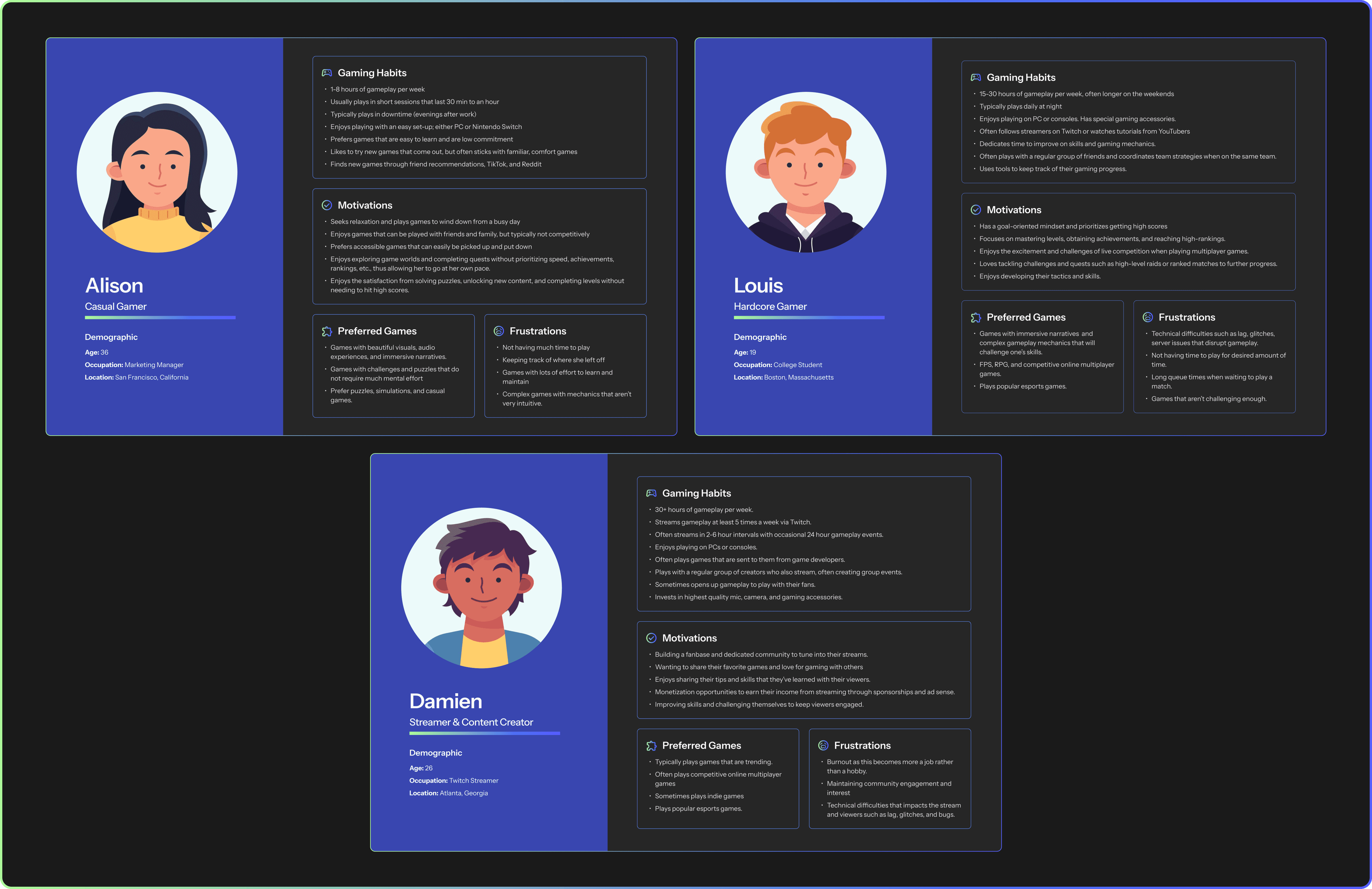
Crafting user personas
Utilizing the data, we can begin to explore putting together user personas to better understand our target audience and make better informed decisions. At this step, I simultaneously took into account the primary requested features from participants. I began to consolidate answers into a list of features to be included in the app.
IDEATE
Card sorting and building the information architecture
Open card sorting exercise
Preparation
For the card sorting task, I compiled a list of possible functionalities and pages for the application. I used the responses from the survey and market analysis to guide my choices. Afterward, I put these ideas on 30 post-it notes and mixed them up on a whiteboard.
Conducting the card sort
With the generous help of survey participants, I explained the instructions and gave them 30 minutes to complete the card sort. Throughout the exercise, I took note of their thought processes.

Stage 0: Randomizing the cards

Stage 1: Participants sort through cards
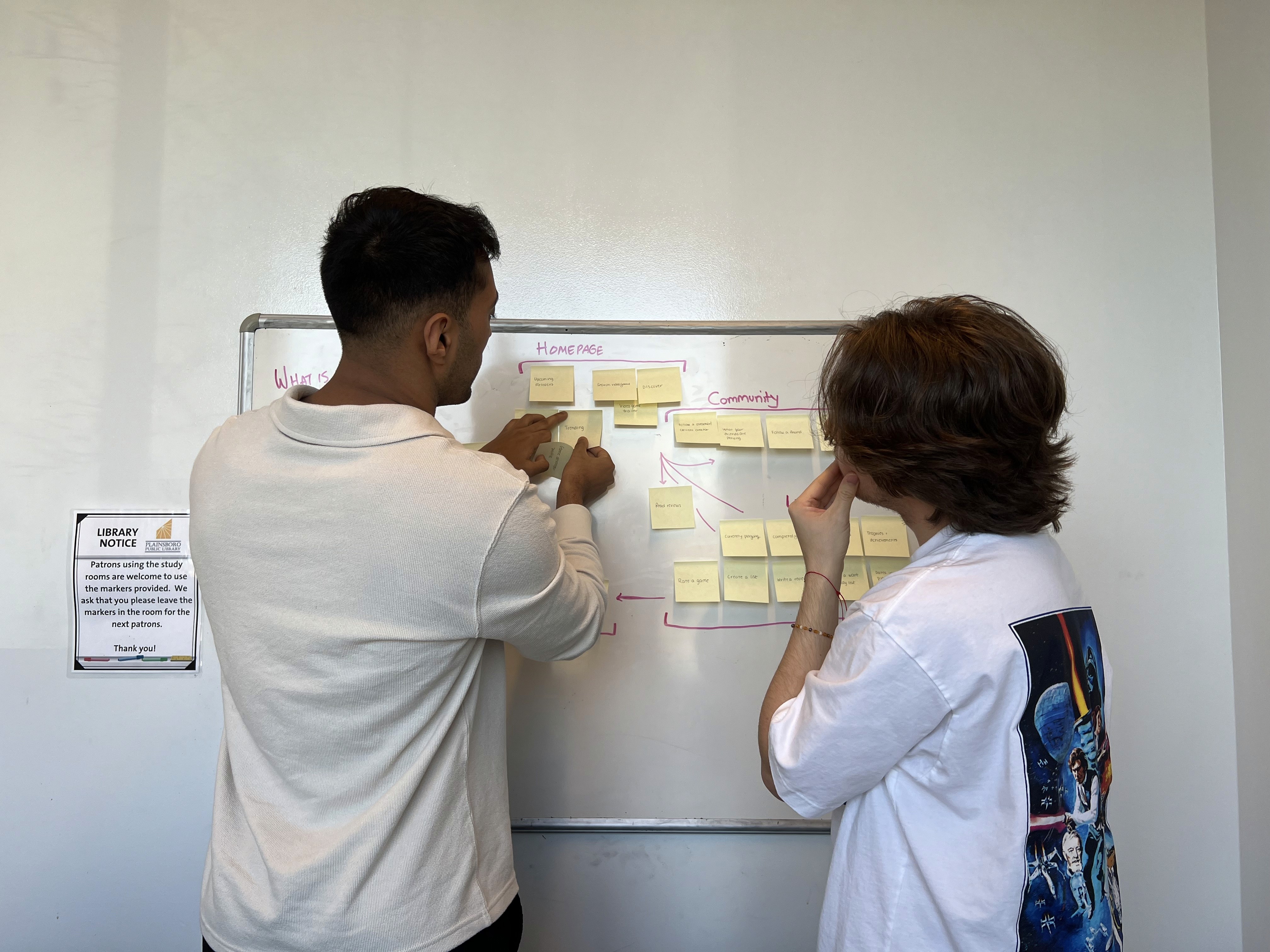
Stage 2: Creating groups and moving cards around
The results of the card sort
In the below image, the participants grouped the cards into five main groups – Homepage, Personalized Section, Community, Library, and User Profile. The participants referenced the Homepage from Letterboxd, and were unsure of a potential homepage name for this app – but agreed that ‘Homepage’ would be insufficient.
The lines between Personalized Section and Homepage represents their idea that the cards are similarly related.

Their final grouping
Creating an information architecture map
Using the data obtained from the survey and card sorting, I created an information architecture map to visualize the structure of the content. The map helped breakdown the features needing to be designed and understand the hierarchical relationship between the pages.

User flow journey from game discovery to completion
With game discovery and tracking as the top features, I built out the user flow from the discovery of a game to its completion. Building this user flow enables the design to be intuitive and completed effectively.

DESIGN
Lo fidelity design
Creating lo-fidelity wireframes
Combining the findings from the user research and market research with the created information architecture map and user flow, it was time to build the lo-fidelity wireframes. These designs illustrates key features and usage flows.

DESIGN
Exploring the design solutions
Designing PixlProgress
Throughout the design process, I made design solutions and screens based off of both user and market research, along with getting feedback from peers. Luckily, a few people from the surveys were open to being that point of contact. I was able to get their eyes on different layouts, solutions, and also understand their usage expectations. This was done via Zoom.
01
View video game details and reviews
Each video game will have their own page that includes: the game overview, release date, game developer, average rating, genre, platforms you can play the game on, ratings & reviews from friends and the Pixl community, and recommendations based on the selected video game.
02
With many Letterboxd and Goodreads users citing incomplete statuses and poor rating options, it became a priority to ensure that ours didn’t fall short. To do so, there is an overall rating that can be rated in half stars and a breakdown of ratings for game play and graphics. Users can also indicate whether or not they completed a game or DNFed it.
03
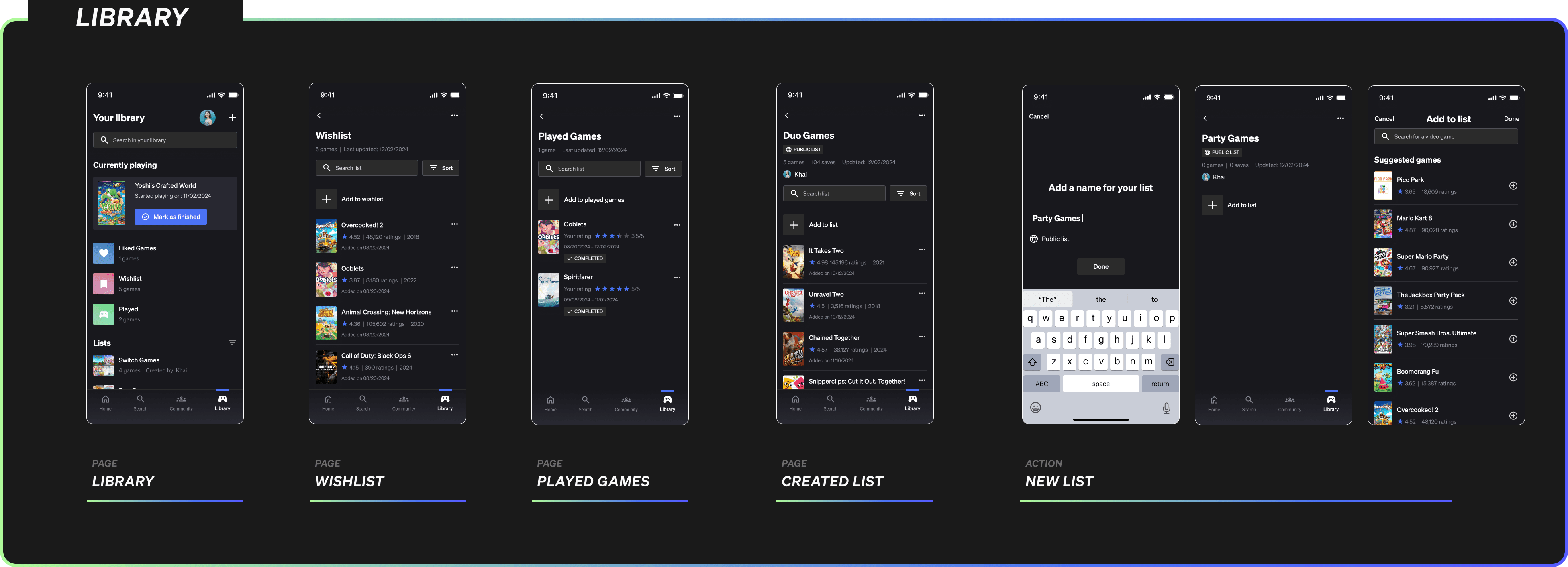
Keep track of games a user wants to play and has completed playing
Users can add games to their wishlist (easily accessible buttons on the discovery pages and video game page), can create their own lists, and view their completed games. Wishlists, liked games, played games, and lists can be found in a user’s library.
04
Connect with friends and view their game play
On the community tab, users can view updates on their feed from friends such as their ratings + reviews of games, starting new games , and adding games to their lists. On a friend’s profile, users can view their friend’s wishlists, public lists, liked games, and played games.
05
Discovery of trending games, new releases, and recommendations
With so many different games and types of games, users can easily find personalized recommendations on our ‘For You’ page based on their genre preferences, previously played games, and wishlist. Users can also find generic trending games of the week, month, year, and all time.
DESIGN SYSTEM
Constructing the design system
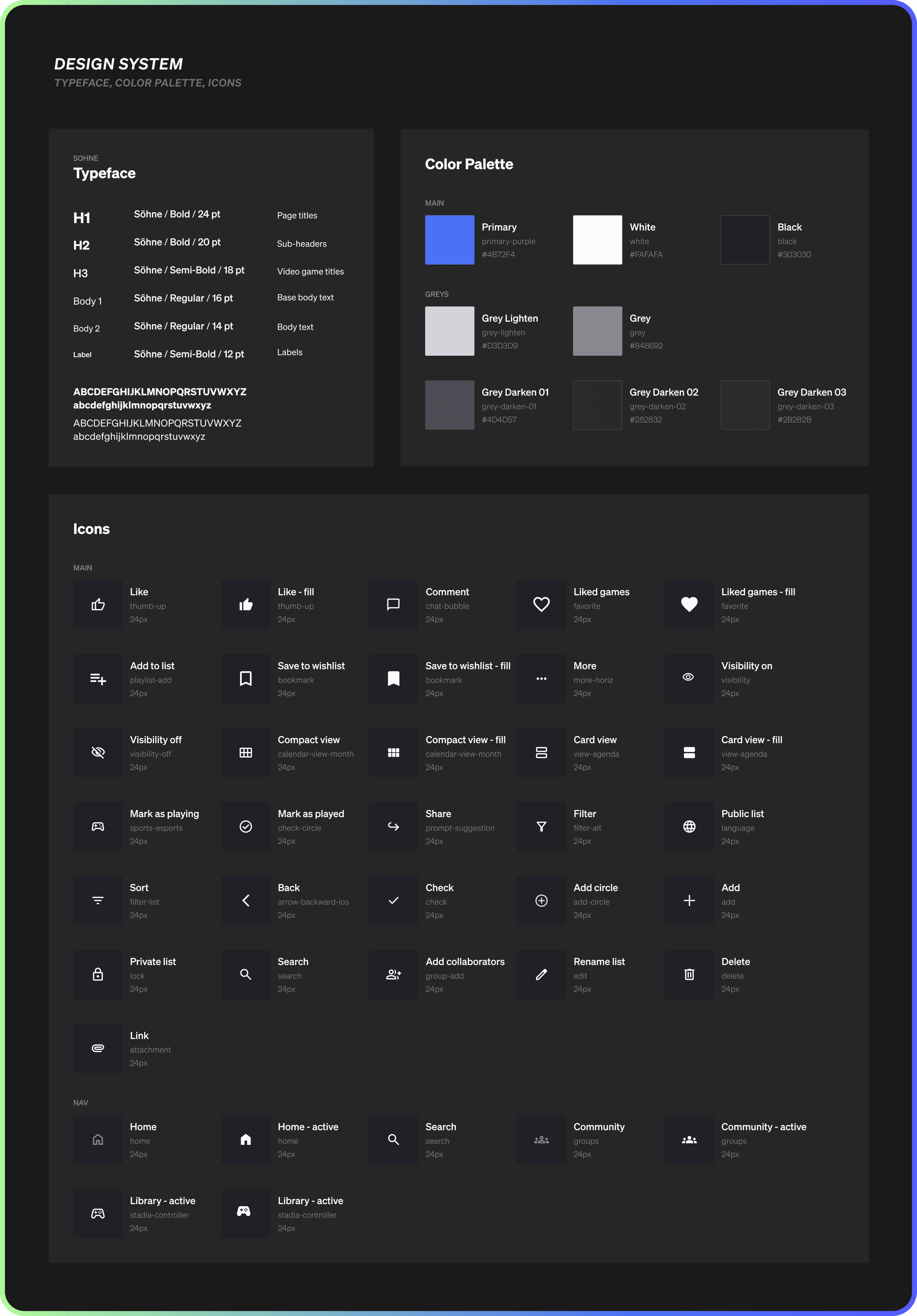
Typeface
The overall look and feel of the app needs to be clean and modern, thus requiring a sans serif typeface. After playing around with different options, I felt that Söhne felt the most right.
Color palette
For the color palette, I went for something that was bold and contrasting. The base of the design and most elements in the app are a neutral deep slate gray, that contrasts well with a vibrant purple accent color.
Icon library
The icons used throughout the design are from Material Symbols. The base icons are outlines and become filled when an action is performed or when it is active (i.e. If a game is saved to your wishlist it'll be a filled icon vs. if it's not yet saved it'll be an outlined icon).
Designing the components
To make designing easier and consistent throughout the wireframes, I created components for elements that will be reused throughout the app. The components ensure that there's no guessing or inconsistencies in spacing, sizing, and usage.

FINAL DESIGN
Full walkthrough of PixlProgress
User onboarding
A user's first impression falls into the onboarding process, thus creating an intuitive, meaningful, and quick flow is imperative. Within this, I incorporated Google SSO and Apple SSO for ease of use. Users can then input the platforms they play on, genres they're interested in, and add suggested games to their wishlists. Their responses will help to set up their recommendations. Of course, users can edit their preferences on their profile.

Homepage
The homepage is home to the For You and Top pages that prompts discovery of new games. The 'For You' page is home to recommendations based on games that you've liked, added to your wishlists, previously played, and upcoming releases based on your interested genres. Naturally, the 'Top' page includes top games overall and can be sorted by all time, year, month, and week.

Search
Within the Search, users can browse by genre or platform. They can also search for video games, lists, and users using the search bar.

Video Game
When a user selects a video game, they can read the details, look at reviews from friends and the community, see recommended games, and complete an array of actions: add to list, liked games, and wishlists, mark game as playing, and write your review of a game.

Library
The library contains all of the games a user has added to their wishlist and liked games. They can view all of the games they have finished playing and are currently playing. Additionally, the library houses a user's created lists, followed, and collaborative lists.
Community and Profile
Users can view their feed and notifications. Their feed consists of updates from friends like: their ratings on games, when they start playing games, and newly added games to lists.
On each user's profile, they can add their bio, Twitch links, and selected genres and platforms. Additionally, this is where other users can view their friend's game library (public lists only) and see their ratings.

LEARNINGS
A reflection on what I learned
01
Communicate with potential users throughout the design process.
Since this is an entirely new idea with no existing users, it was crucial to communicate with interested parties from the start. As with every design process, sometimes your initial ideas are refuted by users. For example, when I first played around with ideas I had game updates on the video game page and thought of user stats. Instead, I received feedback that the updates made it seem like this was a video game purchasing app (similar to the Apple or Google Play store) and that stats would be too tedious to input in.
02
Consistency in prototype animations is key.
I focused on improving my prototyping skills throughout this project and immediately noticed the importance of the timing and type of prototype animations are crucial to a smooth user experience. Even a change of 5ms makes a difference in the flow.
03
Designing a personal project with a multitude of layers requires a to do list and clear timeline to keep yourself accountable.
As this was a personal project with no 'real' timeline or stakeholders waiting on me, it was important to keep myself accountable to ensure that I was productive and continuous with the project. I also made note of different phases that could be implemented, as I am currently researching the possibility of making this into a working application :)
More case studies

DESIGN SYSTEMS
INTERACTION DESIGN
Creating a Scalable Design System
Curate | End-to-end process of building a design system from the ground up, collaborating heavily with engineers and product managers.

USER RESEARCH
UX DESIGN
User Onboarding Flow
Curate | Rebuilding the onboarding flow to increasing activation and retention and encourage users to see product value from day one.